Posted By Jeff Bruneau
For my final wall post of the semester, I would like to simply say that I had no idea what to expect from the world of contemporary art. There are just so many different forms I learned that you can really find the art in anything. This is because how you interpret the art is what matters the most. The modern artist knows this and simply does enough to get those juices flowing just to make you think. The rest is up to the audience.
Wednesday, May 5, 2010
Rock Wall

Posted by Jeff Bruneau
As I browsed through William Powhida’s paintings, I could not believe the incredible amount of detail he puts onto the page. His paintings and drawings are very similar and yet I can’t believe some of his paintings are not drawings because he gets down to the smallest detail. There is just so much going on in every painting. The painting I enjoyed the most was the Rock Wall. I thought it was interesting because it had all the ingredients that one thinks about when they think about the craziness of the music industry and there it was, just slapped onto one frame. It’s funny looking through each picture within the picture and nodding like “yeah, that makes sense.”
Vik Muniz- Diamond Davis
 Posted by Jeff Bruneau
I think Vik Muniz’s ability to use diamonds to shape a portrait is a pretty intriguing concept. My parents were always watching old movies on TV when I was growing so I recognized this one as the star, Bette Davis. It’s interesting because when I find myself looking at it, Muniz does such a fine job that I forget they are diamonds. Even in the hair, where it is not all filled in with diamonds, it still does not strike me as being strange. Although, how he uses the diamonds for the face and for the hair are definitely contrasting techniques. His ability to know where to put the diamonds to give it the correct shading is remarkable.
Visual Art In My Life
 Posted by Jeff Bruneau
This class has really made me think about what kinds of modern art I may have created or come across during the course of my day this past semester. Last week for ROTC we were running around RPI’s campus and I noticed this kind of windmill looking object that was just set in the middle of the academic quad and I definitely thought to myself that it could be considered a work of contemporary art. Then my thoughts shifted to the picture above. This is called a synchronization matrix and its purpose is to detail what every person’s responsibility is during a training event. For example, I find my name in the left most handed column and then trace that row and I know exactly what I need to do at what time. I created this for a weekend training event we had in the middle of April and I color coded it based on the category of one’s responsibility. I think given its purpose and color schemes, I consider it a work of art because a good synch matrix can be the difference between a successful and not so successful training event.
BOB (Bright Orange Ball)

Posted by Jeff Bruneau
Strangely enough, I did like Olafur Eliasson’s weather project. Eliasson is interested with how people react to the weather and it makes me think of my experiences thus far in the army when before the sunrises we are working out or conducting some time of operation. And then the sun appears or like we affectionately call him Bob, for Big Orange Ball, and it just gives you that sense you are not alone. It brightens up your day and ends the cold in those mornings when you just do not want to get up but you have no other choice. This picture reminds me of Bob and its brightness overwhelms the entire photo and it gives me that same relief it would if I was in the field
20x200-"Tear the Cover Off Of It"

Posted By Jeff Bruneau
Browsing through 20x200.com, I found quite of few different pictures that actually caught my eye. This did surprise me because some of the things were pretty out of the ordinary. However, one that I would buy would be this picture with the cover off the ball and only the stitching show. I played so much baseball when I was growing up and ripping the cover off the ball and then unraveling all the string and yarn was so much fun. It actually reminds me of the first time I did it and how long it took me to get to the little ball at the end. I had some of the greatest times growing up when I was playing baseball and I would buy this just because it would make me happy every time I saw it.
Mona Lisa Curse Documentary
 Posted By Jeff Bruneau
The Mona Lisa Curse was a documentary by art critic Robert Hughes that discusses the relationship between money and art. I thought it was appropriate timing for when we watched it because there have been different reasons as to why the artists we have taken a look at thus far have gotten into art. I have wanted to know about this because some of these artists that we have looked at make an absurd amount of money. I mean if there are people out there who want to buy and display these works then by all means purchase it but I would just never spend that kind of money on something like that. Like any major industry though, they are looking to make money, like music for example, so I am not that shocked by it.
Tang Museum

Posted by Jeff Bruneau
For our museum trip, we went to the Tang Museum at Skidmore College. I was surprised to see that the gallery was so wide open which I thought was funny because it seemed like they had more employees working there than pieces of art. The roller coaster bed was definitely the coolest piece of artwork they had there. I think that made quite the impression on everyone who visited it, including students from other groups I had talked to. The pictures they had in the upstairs gallery I didn’t really understand but their use of colors really left me with quite the psychedelic impression. The color scheme and how the colors were organized made me feel like I was on an acid trip. Above is one of the pictures I was able to sneak in. I wanted to get a picture but those people trailed our group…I did not like them!
Graffiti

Posted by Jeff Bruneau
I really enjoyed the video we watched about graffiti. Whenever I’m in the car and I pass by some graffiti on the highway I’m always wondering about when that object was drawn or that phrase was written. I like to think about its origins and the reason why it was up there. The video offered that glimpse/behind the scenes perspective which was pretty cool. For some of these artists, I like how they just draw what comes to them and even come back to write on the same train year after year. It gives their art a lot more meaning and I can appreciate that.
Sports Cards Collection

Posted By Jeff Bruneau
When we talked about collecting things in class I could not help but think about how I was really into collecting baseball, basketball, and football cards. I really tried to keep them in as best condition as possible. I kept them in binders with those plastic sleeves. I liked collecting baseball cards the best and I liked to trade them with my brother and my friends. I was always on top of the value of each card each year and I was constantly searching for that high value card. The combination of the value of each card, the care for them, and how they are organized is definitely art. Unfortunately, I think collecting sports cards and trading is dying out. That’s just the impression that I get.
Tang Museum
Posted by: Eric Schaible


As my roommates have already blogged, on Friday, we all went to the Tang Museum at Skidmore College. I would just like to point out a piece in Casey's blog that turned me off from the exhibit- the fact that the workers were so uptight the whole time that we were there. The picture above (and also posted by my roommates) shows my favorite piece at the gallery, yet we didn't even have time to completely enjoy it and try to analyze it. The fact that the workers were so overbearing did not help my desire to actually be at the gallery at the first place. I hope that something is done so that in the future, they will be more open to new guests and willing to help out people who are new to the art world.
Tuesday, May 4, 2010
Tang Museum (Skidmore College)

Posted By: Casey LaChapelle
Los Carpinteros
Since my roommates all had different schedules it was hard for us to figure out where to go for our museum project. We finally decided on taking a trip up to Skidmore in Saratoga. It was close, convenient and we were all able to attend.
The first thing that I noticed when I walked in was how open the museum was. There was a lot of exhibit space that wasn't used. Looking into one of the rooms before we headed upstairs was a roller coaster looking bed, before we moved on I thought that was going to be the most interesting piece in the place.
As we went upstairs, I couldn't help but feel like we were being watched and followed...and in fact we were, it made us feel really uncomfortable. As we were looking at the artwork, the guy that was working there was standing behind us, it made us feel really rushed and didn't allow for a very good experience. We quickly drifted through the upstairs portion and went back downstairs to get a closer look of the bed, once again a different worker was following us around. We decided to head out as we weren't even enjoying ourselves with these people on our backs the whole time.
While I was at the museum, the roller coaster looking bed was definitely the highlight. The picture above doesn't do it any justice, this thing was huge and looked very contemporary. The whole aspect of this exhibit was that the artist took everyday objects and turned them into fantastical objects.
Overall I would grade my art museum experience a C. Some of the stuff looked interesting, but it was as if we weren't allowed to look at our own pace and it became annoying.
 Posted by John Pedlow
A few classes ago this image was brought up and it really caught my eye. Though I have seen on numerous occasions the image of the marines raising the flag on Iwo Jima and I watched on T.V as the firefighters raised the flag after 9/11 I never put the two together. However when looking at them side by side they seem incredibly similar. These were both historic events in America history and the fact that they each have a very similar picture is quite interesting. I am glad this image was brought up in class because otherwise I would never have put the two together and seen how eerily similar they are.
Dave Hickey Podcast
Posted by John Pedlow
During this podcast Dave Hickey touched on a couple of points that intrigued me. First that some people are getting into the art business for the wrong reasons such as money and secondly that art dealers are creating false values for art. To me if you enter the art world you should be doing it because you love art, the money should just be something that you get should your work be good enough. It is like sports to me, most athletes play sports because it is something that they love to do. The money that professionals get comes along because they happen to be the best in their business, but it is not the reason they start playing sports. The same should be true for artists, be an artist because you love art. The second point about art dealers really bothers me because it does not seem that they care about art what so ever. They are just in the business to get rich and end up driving up the prices of art for their benefit and not because the art is actually worth it. This is wrong and makes it so some people can not afford art that they like and museums, as was described in Mona Lisa's Curse, are unable to purchase art because of the astronomical prices. To me this is completely wrong and seems slimy.
During this podcast Dave Hickey touched on a couple of points that intrigued me. First that some people are getting into the art business for the wrong reasons such as money and secondly that art dealers are creating false values for art. To me if you enter the art world you should be doing it because you love art, the money should just be something that you get should your work be good enough. It is like sports to me, most athletes play sports because it is something that they love to do. The money that professionals get comes along because they happen to be the best in their business, but it is not the reason they start playing sports. The same should be true for artists, be an artist because you love art. The second point about art dealers really bothers me because it does not seem that they care about art what so ever. They are just in the business to get rich and end up driving up the prices of art for their benefit and not because the art is actually worth it. This is wrong and makes it so some people can not afford art that they like and museums, as was described in Mona Lisa's Curse, are unable to purchase art because of the astronomical prices. To me this is completely wrong and seems slimy.
Collections

Posted by John Pedlow
A couple of weeks ago in class we were talking about collecting things as works of art. I have never actually thought about this as art and I am still not too sure about how it is considered art. Collecting stamps or golf balls to me is not really art unless you are talking about each individual one as an artistic work on its own. I started to think of what I collected as a child and I came up with that the only thing I ever collected for a significant amount of time was baseball cards. Then I started to think how you could consider baseball cards art and I came to the conclusion that I guess baseball cards can be considered art because really they are just photographs. So if you really want to stretch it there I guess you could say that I collected art on some level when I was a child.
Tang Museum

Posted by John Pedlow
This past friday Casey LaChapelle, Eric Schaible, Jeff Bruneau and myself went to the Tang Museum at Skidmore College. After spending some time looking at some of the paintings that were honestly pretty trippy and weird, we were about to leave when we saw the part of the museum that had the roller coaster bed. This was easily the highlight of the trip up there because this bed is really cool. I am thankful whatever possessed the artist to construct this bed because it is the coolest bed that I have ever seen. To think that I almost missed this on the trip up there is mind boggling because all of the other exhibits were just not that enjoyable for me because I felt that I would need to be tripping on acid to understand what the artist was trying to do in their paintings.
Jeff Koons

Posted by John Pedlow
This is one kind of art that Jeff Koons is known for. Large reproductions of things such as balloon animals made out of stainless steel and often, much like this one, these reproductions are brightly colored. This is a kind of art that to me I would not have thought about as art before this class but that is because I would not have thought about the time and effort that goes into a piece such as this. Also I probably would not have seen this piece as being credited to one person. However after taking this class I understand what goes into pieces such as these. Also this particular piece is pretty cool because it actually looks like a real ballon dog.
Earth From Space

Posted by John Pedlow
This particular picture is obviously not from an artist we have talked about in class, but yet I still find it interesting enought to blog about. Pictures of Earth at night from space have always caught my eye and I have always considered myself fascinated by them. Every time I see one of these pictures I find myself stopping and looking at it for at least a minute or two. Maybe it is because I like geography that I look at these because I always like to look for the brightest spots on the map and they, for obvious reasons, are always around major cities such as New York and London. I have also always liked to look at the areas that there are seemingly no lights such as Africa and large portions of Asia. It really makes you realize the different life styles people in the world live and how technologically advanced some areas of the world are compared to other areas.
20x200

Posted by John Pedlow
This the picture from 20x200.com that I would purchase. It is a picture of Cairo, Egypt and though I have no particular connection with Cairo and I am not of Eyptian decent this is the picture I would buy. I have always for some reason liked pictures of cities, maybe it is because at my house we have paintings of Albany from around the turn of the century, I don't know. Maybe it has to do with the fact that cities are always busy and bustling that I have some fascination with these kinds of pictures. It could be that I just like to see seemingly endless lines of buildings and skyscrapers. I can not quite put my finger on why I like them and it is probably a mixture of the reasons that I just listed.
Carsten Holler
 Posted by John Pedlow
This is Carsten Holler's Test Site which was displayed in Tate Modern between October 2006 and April 2007. The work consisted of five slides made of metal and fiberglass. This to me is one of the coolest forms of art I have ever seen because visitors were allowed to slide down the slides. I would never before taking this class have considered something like this art and would have just thought that they were some pretty huge slides. However after taking this class I have broaden my view of what is actually art and this definitely is art and I must say that this is one of the more interesting works I have come across.

Posted by John Pedlow
This is Olafur Elliason's Weather Project and it was installed at the Tate Modern in 2003. Elliason used humidifiers to create and mist in the air and as you can see used many lamps to create a sun like light. The ceiling was covered with mirrors so that people could look up to and see themselves as black shadows against an huge orange light. Many people when viewing this work of art would lie down on their backs and wave them arms and legs and watch themselves in the mirror. This particular work of art to me is pretty cool because it is such a massive work and must have taken a great deal of time and effort to put together. Also the effect given off by the work must have been awesome and I would actually liked to have seen this myself.
9/11 Iwo Jima Relation
Posted By: Eric Schaible


This picture that was shown in class has a very strong meaning to any person that looks at it. The similarities are quite astounding, with Americans lifting a flag over an already destroyed location. During Iwo Jima, the Marines are raising the flag on top of Mount Suribachi during World War II, but the second picture shows firefighters raising the flag over the rubble from the World Trade Center Towers after the terrorist attacks on 9/11. Both pictures show a sign of strength, with the Marines being able to complete a mission and help the Allies advance in the War, and the firefighters being able to fight on even after so many precious lives were lost on that day.
Andy Warhol

Posted by John Pedlow
This is one of the images that Andy Warhol is known for, his classic Campbell's Soup image. He has done other paintings of products such as Coca-Cola as well and to me it is an interesting way of making art. You never think of these kind of paintings when you are thinking about art, you always think more of something like the Mona Lisa. However these types of paintings are just as much art and in fact I think that these kind of paintings are interesting because people can relate to the product because it is part of their everyday life. Therefore Andy Warhol's paintings such as this Campbell's Soup have opened my eyes as to what art actually is.
The Weather Project
Posted by: Eric Schaible

When viewing this installation piece in class, I couldn't help to understand the true meaning of it. From the outside, I just saw a big yellow ball that looked like the sun in the middle of the room. When I finally sat down to actually examine it and attempt to figure out its meaning, I realized that it was much more than that. From reading about the actual installation, I found out that there is actually a mist injected into the room at random points during the day to resemble fog and the environment and then disappears to the top of the room where the is a hole in the ceiling. Upon looking up, an observer sees a mirrored image of the floor. The picture above is actually looking down on the "sun". Observers are able to view the bulbs behind the circle if they stand directly below it.
Once I read a little more into the piece, I found that he was actually trying to mimic the world around us by creating another type of environment. He went to great lengths to not advertise this piece as a normal artist would for a gallery, but instead posed questions on taxis and flyers regarding the weather. It is said that one of the first discussions that people have is in regards to the weather, so he wanted to use these questions as his basis for marketing. I found this piece to be quite interesting once I was able to get a better understanding of the artist's perspective. I thought that by creating this new environment, one of the first reactions from visitors would be about the weather inside of it, and thus, completing what he set out to accomplish.
Against Interpretation - My Opinion
Posted by: Eric Schaible
This article actually interested me a lot, mainly because it attempted to show what the majority of people do when the look at art. One of the problems that I've always had with art is that I don't understand what the artist was trying to say. Like the people that the article was talking about, I always attempted to over analyze pieces and come up with some type of meaning behind everything. The problem with doing so, according to this article, is that many artists don't want us to look into some type of deep meaning.
"Today is such a time, when the project of interpretation is largely reactionary, stifling. Like the fumes of the automobile and of heavy industry which befoul the urban atmosphere, the effusion of interpretations of art today poisons our sensibilities."
I believe that this quote can pretty much sum up the whole article. We have become so involved with trying to create an image or illusion out of nothing. It really seems as if we must all just take a step back when we are viewing a work of art, and realize that maybe, just maybe, our first impression of it was correct.
The Mona Lisa Curse
Posted by: Eric Schaible
While he may come off as rude at times, Mr. Robert Hughes gives a great response to the current art market. His believes and first hand accounts mimic those from one of my earlier blogs where I discussed a podcast by Mr. David Hickey. While I completely understand the point of purchasing a product when its value is low and holding it until a time when it will be worth a lot, I don't believe that it's right to artificially inflate the price of a work. By inflating the price, I'm talking about an art dealer (or special collector) attempting to create more value for a certain piece so that either the artist's other works would be valued better, or just so that their single piece will garner greater interest. Either way, artists like Damien Hirst should not be able to price his products at such a level that even museums can not afford, and art dealers should not be able to do the same either.
Monday, May 3, 2010
The Recession that Touched Everything
Posted by: Eric Schaible

This is an interesting article that I found while reading my Bloomberg Magazine back in March. Since we were discussing Damien Hirst's pieces in class, I found it funny that I would see an article published in a financial magazine about this artist. As you can read, the recession has truly played a role in the amount of money that were received for works done by Hirst. The article just discusses how there may not be as great of a market as before, due to the economic climate and the high prices that were once normal for his pieces before 2009. Unfortunately, I was not able to find any other information regarding sales for his works for this year.
Custodians of Culture - Schoolyard Art: Playing Fair Without the Referee
Posted by: Eric Schaible
I'm glad that this was one of the suggested pieces for students to listen to for this class. When I first began listening to it, I was in complete agreement with Mr. Hickey's belief that artists are becoming too greedy when it comes to their works. By asking such a high buying price for their pieces, they are actually attempting to create value for something that may not be worth very much at all. I believe that this is a crime and artists should not be able to command such a high price. After I finished listening to Mr. Hickey speak, I realized that it was not just artists' fault for this situation. Many people these days are just out to show that their services or products are better than their competitors and thus, ask a higher price. The problem that we face now is that too many people in this world are overly concerned with making as much money as possible, without any type of respect for others. By attempting to artificially create value for their own products, they are completely messing up the natural supply and demand schedules and scamming others out of their money.
20x200

Posted by: Eric Schaible
If I were to purchase one of the pieces from www.20x200.com, I would have to chose this piece. When I first saw it, it reminded me of being at my relatives lake house down in New Jersey; a location where I like to go when I have free time over the summer. It's usually very calm on the lake and it's extremely peaceful. The photography was really able to show a picture of tranquility and I would not mind having this piece in my house. With papers and reports being due every week, it can be stressful to be a student, and everyone needs time to just relax and unwind from a long day. By looking at this picture, it shows some of Earth's natural beauty and allows the person to think about a relaxing atmosphere.
Art Cars - The Explaination
Post by: Eric Schaible
When I first saw Andy Warhol's BMW Art Car in class, I was not sure how to take it. I've always enjoyed automobiles, but I believe that classic and/or rare cars are best left to their original conditions. These were created for a specific time and should forever be held to that standard. I look at cars as many people look at art, I like to enjoy the work as it was initially intended. However, after listening to some interviews from artists who have been a part of this program, I have a new understanding for their perspectives. To them, it is not just a car, but a way to illustrate their visions for the world to see. When BMW originally made these cars, it was what they believed to be the best design for the masses. What these artists do, is to create their own picture of what BMW wanted to show. By taking a class in art, it has allowed me to think "outside of the box" and take others' interpretations into account. It is also ironic that many artists who have participated in the Art Car program have been people that we have discussed in class.
Jeff Koons - BMW's Next Art Car
Posted by: Eric Schaible
On February 2nd, BMW announced that artist Jeff Koons would be the next to provide a car for their series of Art Cars. The ironic part about this, is that without taking the Intro to Visual Arts class, I might never have know who he even is. With recent interpretations of the BMW's "Art Car" series recently being focused on the artists' experiences rather than the car (i.e.: Robin Rhode's driving experience and Olaf Eliasson's piece on global warming), Koons has decided to focus more on the car and neglect its surroundings. What's most interesting to me is that the car design looks very subdued, as compared to some of the pieces that we saw during class. Although the paint scheme is a mixture of many colors, I would be expecting to see possible additions to the body of the car or something that would make this stand out more than a regular car. The car in question will be the new BMW M3 GT2 race car, and will be the 17th Art Car for BMW. It is expected that the car will be completed in June.
Robin Rhode - An Expression of Joy
Posted by: Eric Schaible
This video was used as a marketing piece by BMW as a part of their "Art Car" collection. This video was used by BMW to highlight the creation of their new Z4 model for the 2009 year. The main difference between this car and the one used previously, is that while the other cars were used as the canvas, the car is actually perceived as the artist in this work. Mr. Rhode's driving force behind this creation was to show a common link between art and automotive enthusiasts; that both are a combination of power and emotion. The power from the car is balanced with Mr. Rhode's ability to create a wonderful masterpiece.
While the piece may look like it was crafted without any type of guidelines, Mr. Rhode actually began with black finger paint on a piece of paper to illustrate the desired results. From here, he created a storyboard for the drive and gave a driver specific instructions for how to proceed. To actually apply the color, paint nozzles were added within the wheel arches to spray at the artist’s desired time. I think that his project does a great job in showing how art can be linked to many other cultures. By using a brand new car to illustrate his artwork, he has been able to bring the automotive world, where enthusiasts look at a combination of forms and functions, together with a culture based around a vast array of subjects.
Andy Warhol’s 1977 BMW M1 Art Car
Posted by: Eric Schaible
With very little background in art, I found Andy Warhol’s work to be quite fascinating because of the canvas that was worked on. Before elaborating on my own thoughts on this piece of art, I would like to give a quick background on the actual car that this work was done on. In 1973, BMW created a division, now known as their M-division, designed specifically for high performance cars. In 1978, they raced their M1, a car originally developed by engineers from Lamborghini, in Formula 1 races, but was required to have a production version of this car available to consumers if they wished to continue racing in the Procar Series. Because of this, 450 M1 cars were produced for their customers with a downgraded 6 cylinder engine that produced significantly less horsepower than their race versions. From the time that this was announced, the M1 was lamented as a collectors’ item.
When asked about his inspiration for the painting, Mr. Warhol said, “I tried to portray speed pictorially. If a car is moving really quickly, all the lines and colors are blurred.” In the video posted above, you can see that the car was painted using paint brushes, as opposed to spray guns which are normally used for production cars, and even his fingers to gain the specific effect that he was looking for. It was also noted that previous artists had used scaled down versions of their cars before actually painting, but Mr. Warhol did not do so. This shows that he was confident in his ability to portray the illusion that he had in his mind directly to the car. While some BMW fanatics do not appreciate the fact that this was done on such a rare car, many might be surprised that this was actually raced competitively in 1979, and won 6th place during the 24-hour Le Mans race. While I also found it disturbing that he would be allowed to do this to a car of its stature, my opinion has been changed because it was actually used as both a marketing piece competitive component to BMW’s racing division.
The weird part about this car is just how it was painted. As stated before, most cars are painted with a spray gun, with brushes being used for small details (such as pin striping). The fact that he went directly at this car with a large paint brush shows the difference between an artist and just a regular body shop worker. I found his attention to detail to be fascinating, with the finger marks throughout the body of the car to show the “speed” aspect of the car. After doing a little more research into this car, I can say that my opinion of Mr. Warhol’s interpretation of this car is a very good representation of what the car was able to do.
Wednesday, April 28, 2010
Iwo Jima vs. September 11th

Posted By: Casey LaChapelle
Iwo Jima vs. September 11th
During class on April 20th, Professor Blum put up a picture of Iwo Jima and September 11th side by side showing both the Marines raising the flag at Iwo Jima, and the Firefighters raising the flag among the rubble right after September 11th. The sight of these pictures are almost eerily similar and the theme is breathtaking. With Iwo Jima, the Marines were celebrating a victory, albeit among a lot of bloodshed, and September 11th, the most devastating event to ever occur on American soil. The pictures look the same, but the context to which those individuals are raising the flag comes at much different circumstances. It was a breathtaking picture.
Andy Warhol

Posted By: Casey LaChapelle
Andy Warhol
In class on April 6th, we had begun discussing different artists and what they have meant to artists today and their work. One of the artists that we had discussed was Andy Warhol. At the time we were talking about him, I was completely turned off by his artwork because I felt as if it were too pop art-ish. The Campbell's Cans piece is the one that stood out to me as I thought that it was unimaginative and "blah".
Now that I have had some time to think about it, and look at the piece again, I have changed my mind. It took me a few times to look at the piece to look back and remember that one of the most basic art projects I have ever done growing up (in middle school) was to recreate a Campbell's soup can with a brush and paint. Whether or not the art teacher had taken this right from Andy Warhol, I don't know but Campbell's soup is something that everybody can relate to. I kind of see where Warhol was going with this piece and I have a new found respect for it.
Now that I have had some time to think about it, and look at the piece again, I have changed my mind. It took me a few times to look at the piece to look back and remember that one of the most basic art projects I have ever done growing up (in middle school) was to recreate a Campbell's soup can with a brush and paint. Whether or not the art teacher had taken this right from Andy Warhol, I don't know but Campbell's soup is something that everybody can relate to. I kind of see where Warhol was going with this piece and I have a new found respect for it.
20x200

Posted By: Casey LaChapelle
20 x 200 Selection
In class we were asked to go to www.20x200.com and select a piece of artwork that had meaning to us and that we would personally buy if we would like to. The above picture to me is as close to perfect art as you can get. I have always been fond of nature, especially mountains. In this picture you can see a tiny red dot at the bottom right of the picture; its a red pick up truck. That feature makes this picture even more fascinating to me because it really brings home the fact that in relation to the place we live in we are only a little spec on the map.
The Mona Lisa Curse

Posted By: Casey LaChapelle
The Mona Lisa Curse
The Mona Lisa Curse was a documentary that was surprisingly very interesting. After the first part of the movie, I was very turned off by the whole topic and the arrogance of Robert Hughes. I didn't care about art dealers and how they were "ruining the integrity of artwork", however halfway through the documentary I found myself really interested in what Hughes had to say, I even began agreeing with him.
Being a business major, the part where paintings were being brought to auction (being bought by the seller at such a low price) and being sold for an incredible amount of money was fascinating. For somebody to take a painting and turn it into such an large profit took more than business knowledge but also a knowledge of society and art. He needed to be ahead of the curve in society to know that those particular paintings were going to catch on the way that they did, and in the end he was rewarded with a hefty payday. Very interesting.
Being a business major, the part where paintings were being brought to auction (being bought by the seller at such a low price) and being sold for an incredible amount of money was fascinating. For somebody to take a painting and turn it into such an large profit took more than business knowledge but also a knowledge of society and art. He needed to be ahead of the curve in society to know that those particular paintings were going to catch on the way that they did, and in the end he was rewarded with a hefty payday. Very interesting.
Test Slide 2006

Posted By: Casey LaChapelle
Test Slide 2006
When we continued our talk in class on March 4th about Tate Modern, the slide exhibit was brought up. Carsten Höller is the artist of this piece and like the Weather Project, I was completely intrigued. I am not the kind of person to walk around an art museum and look at painting after painting. I work best with interactive things which is why I think I would really enjoy Tate Modern. At the very least, in looking at some pictures and exhibits from class, I have learned that all art does not need to be boring and old fashioned, like I used to think it was.
The Weather Project

Posted By: Casey LaChapelle
The Weather Project at Tate Modern
The Weather Project is a work that left an impression on me from class. When we talked about this art piece I was very intrigued. This is a piece of artwork that I could see myself going to in an art museum. The Weather Project has a lot of meaning because I think as human beings, we can't fully comprehend what else is out their other than the world we live in. With this work of art it brings it closer to home and gives us something we can put our finger on.
In doing some research about the exhibit I was surprised to see that over 2 million people went to Tate Modern to see the exhibit, many of them being return customers. It must have been such a surreal feeling to feel like you were in the same room as the sun, being able to look up and see your reflection.
In doing some research about the exhibit I was surprised to see that over 2 million people went to Tate Modern to see the exhibit, many of them being return customers. It must have been such a surreal feeling to feel like you were in the same room as the sun, being able to look up and see your reflection.
Thursday, March 4, 2010
Damien Hirst's Shark

Posted by: Jeff Bruneau
Every time I think about this class, I always happen to reflect upon Damien Hirst's "Shark" that we viewed in class in the beginning of the semester. I do not view it as art at this point because I still can not help but classify things as art in the traditional sense but Hirst definitely provokes the thought great art has been known to do and it has definitely left an impression upon me. The shark, preserved through formaldehyde, is supposed to promote the fear of death, dismemberment, and danger. The shark does not necessarily strike me with a certain degree of fear but it intrigues me so much. I have always been one of those people who finds these great, powerful animals interesting and I was never one to take a pass on an episode from Shark Week; however, I think it really has to do with the improbability that one could be this close to a shark, ready to attack, and still live to tell the tell. The fact that you can even see inside the body without having to worry about getting eaten is pretty incredible. It does not feel right that this fish is out of the water and yet I can not help but stare at the picture and take it all in. The body is preserved so well that its awesome power just speaks for itself. For all the artwork we have seen, this is definitely my favorite one.
Wednesday, March 3, 2010
2/16: Stuckism


Posted By: Casey LaChapelle
In class on February 16th one of the concepts that was discussed was "stuckism." I didn't really understand it until I started looking at a bunch of different stuckist paintings. Stuckism was started by Charles Thomson and Billy Childish within the past ten years. Their whole motive was to have an answer to modernism in art. According to the stuckism website, the shark cut in half and put on display would not be considered art. They don't believe that anything dead should be considered art.
After reading a little bit about stuckism I find them to be a strange bunch, almost like a cult or weird political figure in the art world. I will admit that I do not know much about this type of art and would like to learn more but reading between the lines they seem like a very hostile bunch over what type of art is better or worse. With that being said I think that some of their stuff is interesting. I like the picture of the skull that has a caption of "life is great," it gives a lot of meaning to the saying "enjoy life one day at a time."
I would be interested to find more out about this type of art as it is still really confusing to me and their theory's are unorthodox.
2/9 Class: Jeff Koons:

Posted By: Casey LaChapelle
In class on February 9th, we had looked at some of Jeff Koons' work. For the first time I was able to relate to some of the work being showed on the screen. As I have stated previously, my knowledge of art is minimal at best and I can never understand what the artist is portraying.
When we looked at the basketball equilibrium, I was immediately interested in the piece as I saw it as something I would love to have in my office or in a sports bar. Maybe this has to do with my love of sports but when I look at this piece I find that it would be an instant conversation piece, which is the point of art.
Every six months the basketballs go out of equilibrium and have to be reset which gives this piece even more meaning. I feel that everything goes out of balance and needs to be reset in order to gain true success. I would love to see Koons do a series of this work such as a baseball and football equilibrium.
Sue Coe: Artist Activist

Post by: Casey LaChapelle
During class we talked about Sue Coe, and her paintings which focus on animal rights. As I was searching through her pieces, the one titled "modern man followed by ghosts of his meat" really stood out to me. One thing that really intrigued me about Coe's work is the fact that they look very similar to political cartoons, I suppose that is the type of look she is looking for seeing that she is an activist artist.
I am a person who eats meat as a part of every meal and to see the perspective of the artist in this piece actually strikes home to me. Its a really interesting view that she portrays the animals so differently then just livestock raised for eating.
Reaction to "Against Interpretation"
Posted By: Casey LaChapelle
To be completely honest, while I was reading this article I had no idea what to think. I was getting lost in the authors translations of other people, historical time periods, etc. I was beginning to wonder how I was even going to respond to the article, until I read the first paragraph in part five of the article.
"In most modern instances, interpretation amounts to the philistine refusal to leave the work of art alone. Real art has the capacity to make us nervous. By reducing the work of art to its content and then interpreting that, one tames the work of art. Interpretation makes art manageable, comformable. "
After reading this section, it clicked for me, because this is what I do. I am so taken back by art that in order to make sense of it all, I have to put my own meaning into every work that I see. Every single piece of art that is put up in class, whether it is a urinal, a shark split in two, or random canvasses with paint thrown all over them. In my mind I am always trying to to interpret what the artist was thinking.
This article made me realize that there doesn't always need to be a true description on art. Why can't the artist just make something that doesn't need to be thought out and put into a distinct category? Why do I need to make sense of everything all the time? Through reading this article I realized that in order to get the full experience of a piece, just let it come alive and enjoy it for what it is.
Tuesday, March 2, 2010
Interpretation Reading
Entry By: John Pedlow
This reading was something completely different than most things I've read about that concern art. This is because this reading talked about how we as a society try to over analyze art and interpret its meaning. This reading said how sometimes this is not what we should be doing and in fact some art is meant to just be taken at face value and not looked into and interpreted. Some of the genres of art that get away from interpretation are Abstract painting, pop art and some French poetry. This was incredibly interesting for me to read because I've always heard growing up you have to look at art and try to find its true meaning. Well according to this reading that is not always true. Also this reading talked about movies and how they have not been interpreted yet because of how relatively new cinema is and also how good movies free us from our need to interpret. So overall this reading was a breath of fresh air because it made me feel good about not being able to interpret art because sometimes that is just what the artist wanted.
This reading was something completely different than most things I've read about that concern art. This is because this reading talked about how we as a society try to over analyze art and interpret its meaning. This reading said how sometimes this is not what we should be doing and in fact some art is meant to just be taken at face value and not looked into and interpreted. Some of the genres of art that get away from interpretation are Abstract painting, pop art and some French poetry. This was incredibly interesting for me to read because I've always heard growing up you have to look at art and try to find its true meaning. Well according to this reading that is not always true. Also this reading talked about movies and how they have not been interpreted yet because of how relatively new cinema is and also how good movies free us from our need to interpret. So overall this reading was a breath of fresh air because it made me feel good about not being able to interpret art because sometimes that is just what the artist wanted.
Sunday, February 28, 2010
The Faces Series - Thomas Mallard
Entry by: Eric Schaible

Artwork is not something that comes natural to me. I don’t typically like it, mostly due to the fact that I just don’t understand it. For example, I am using three of Thomas Mallard’s drawings, which combine to make a series called A Year of Faces. Upon first glance of these drawings, it is hard to me to make out anything of significance except that each woman’s face is distorted, with the left side of the drawing being lower than that of the right. There also looks to be the number 2 dividing each side of the face. It is not until I began researching this artwork, then I found out the true meaning of it.
Thomas Mallard is a man who is well versed in the life of art. He has received schooling from UC Berkeley for art but has also done work in dance, sculpture, etchings, and silk-screenings. With much of his life being dealt with computers, he experimented on and off with drawing and designing. One of his biggest influences over time has come from the work of Pablo Picasso. Interestingly enough, after looking at a few of Picasso’s paintings, it seems as if the disfigured face may have actually been copied. Whether or not this is common place in the art world is out of my knowledge, but I did find that to be quite fascinating. Another form of his inspiration comes from a desire to capture the emotions felt by many people, as shown in the faces series.
These drawings are meant to show people as complex, dualistic, and with a wide variety of physical features. This series was drawn in public, where he used people passing by as his subjects. He wanted to be able to show how people acted in their own environments without any type of influence on their behaviors. Actually analyzing these drawings took some explanation from the artist. Each drawing has more shading on the left side, which makes the viewer realize that there are actually two subjects. The reason for the two mixed into one actual face is to highlight the fact that there are many opposites about people. Such ideas of male vs. female and black vs. white are all supposed to observations by the viewer. By drawing these in public, he is able to draw one subject head on, while the profile of another person is used.
As a casual observer of these pieces, it is hard to formulate an opinion as to whether I think that they should be considered special or not. The faces, at first glance, merely look to be split in the middle with a disfigured emotion. However, after taking note from what the author wanted people to observe, I can realize that there are subtle pieces that cannot be seen unless there is time taken to understand the piece.
Tuesday, February 16, 2010
John Pedlow's Essay
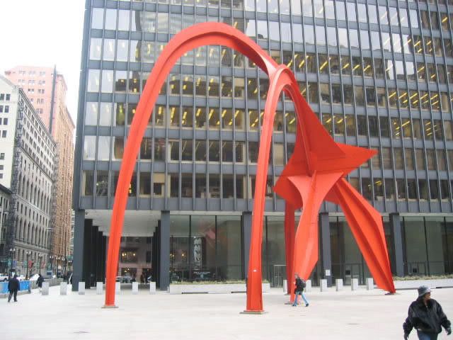
The contemporary artwork that I choose to look at was Alexander Calder’s sculpture Flamingo. I find that metal sculptures are one form of art that I truly do not understand what so ever. I guess you could say that this has something to do with my extremely limited knowledge of art as a whole. Also though growing up I when the word art was mentioned I thought of painting and most likely Picasso or Van Gogh just because they are two of the most commonly known painters. That said though Flamingo is not your average metal sculpture, there is just something about it that catches your eye right off the bat. This very well could be the bright red color that is not typical of metal sculptures or its extreme size in the middle of Chicago, but there is definitely something that catches your eye about this sculpture.
This sculpture is the only sculpture that I can remember (and I haven’t seen that many) that was aesthetically interesting to me. To me the color of the sculpture is what initially catches my eye because it is not the color you expect to see when you think of metal sculptures. After that the actual shape of the sculpture is interesting to me, I do not quite understand why the shape catches my eye as much as it does but there is something about it that intrigues me. That is one of the reasons I took this class however, because I want to develop more of an understanding of art so that I can appreciate it later in life.
Alexander Calder was the artist who sculpted Flamingo and he was born in 1898 in Philadelphia, Pennsylvania and lived until 1976. He was a third generation sculptor and his grandfather was the man who sculpted the figure of William Penn that sits atop the dome of city hall in Philadelphia. However Calder was more mechanical driven at an early age and studied mechanical engineering at the Stevens Institute of Technology in New Jersey. After receiving his degree in 1919, Calder held a number of jobs until he tried his hand at art. He gained fame for his sculptures and mobiles over time and his fame peaked in the 1970’s, which happens to be the era that Flamingo was created in. Flamingo was created unveiled in 1974 in Chicago. This sculpture is a massive 50 ton work of art and is made up of steel and is located in Chicago’s Federal Plaza. I hope to at one point after taking this class to be able to look at a work of art like this and at least try and be able to understand it.
Monday, February 15, 2010

Taking Issue with a Contemporary Art Piece
Posted by: Casey LaChapelle
In doing some research on the Internet to find the perfect painting or sculpture that I didn't understand, it dawned on me that as long as I can remember, I turned my nose up to modern/contemporary paintings. I have downright found them unappealing. Growing up, my great grandfather was a painter, he did this for a living and I, still to this day love his work never understood why people would look at a piece of contemporary artwork and believe that it was good.
The given reason above is the main premise on why I decided to take this class, as I would like to me more educated about art as a whole and not sound or think so naive when it comes to good art. I finally came up with a painting that I look at and say to myself, "I just don't understand what is going on here". It is titled "Blue Vase" painted by José Manuel Merello. Merello is a Spanish born artist who states that his work has some Picasso in it, but likes to add that this is mainly his own style. He is also a self-taught artist who has paintings shown throughout the world.
In looking at this picture (appendix A) at first glance all I see are a bunch of heavy strokes on a canvas that a typical elementary student could do. Although I don't find this art beautiful or interesting, after looking at the piece for a period of time it began to dawn on me that art is truly in the eye of the beholder. No one person will look at art in the same exact way.
This type of painting is Merello's style. In looking at his other works, you can see a distinct pattern in the way he creates his paintings. They all have a distinct look about them. The painting that I chose, "Blue Vase", is very distinct because although there is so much going on around the featured blue vase in the painting, one thing sticks out and that is the blue vase in general.
It took me some time to realize Merello's style, but when I did it began to make sense to me. All of his paintings have one thing that is in the center, the focal point that the viewer automatically sees, at which point all of the other strokes and things in the painting mold together to form sort of a natural boarder around that one point.
I hope that in taking this class I will be able to distinguish between different artists and not have such a closed mind when it comes to different types of art that I may not be accustomed to.
Subscribe to:
Comments (Atom)